Objective
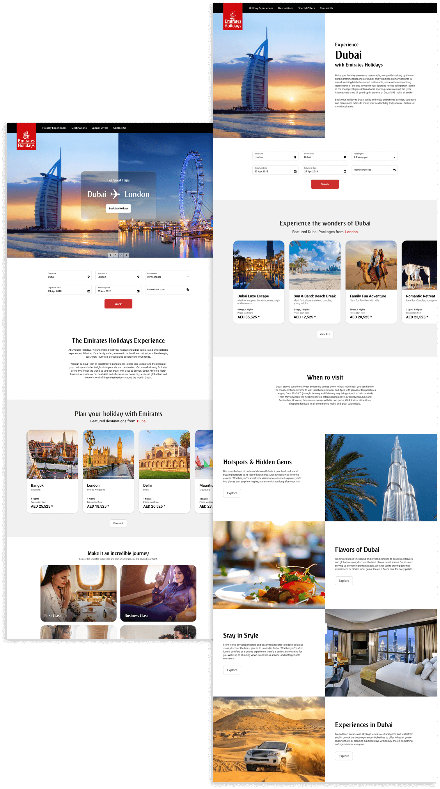
Redesign Emirates Holidays to create a seamless, modern, and user-centric experience.
- Streamline the booking journey from search to confirmation by enhancing features, reducing friction to drive conversions, and improving satisfaction with clearer, more intuitive flows.”
- Compartmentalize data into clear categories to improve information access and simplify user processes
- Revamp the UI to align with current standards and guidelines, with a focus on minimizing cognitive overload.
Understanding the problem
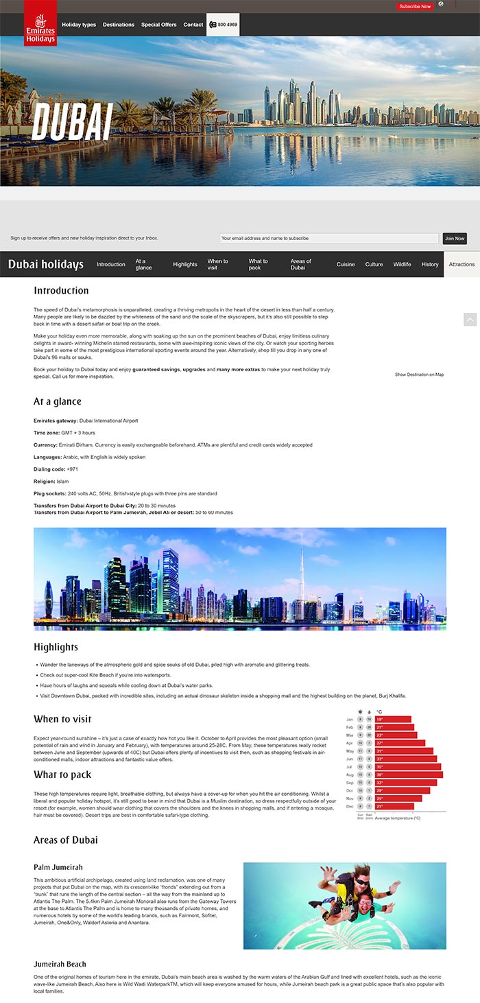
- While the site offers premium travel packages, the user experience is fragmented with slow performance, confusing workflows, and poor usability, especially during the booking and planning process.
- Lacks clarity in the available features and services.
- No clear progress indicator during multi-step booking.
- Users can't easily go back or edit previous inputs without restarting.
- Critical decisions (e.g., hotel choice, transfer selection) lack context or preview.
- No smart recommendations based on user behavior or location.
- Cognitive overload caused by text-heavy layouts and poorly compartmentalized information.
Design Audit: Identifying Pain Points
Lack of intutive menus, filters and search options
The homepage should clearly communicate the service’s offerings and benefits; failing to highlight core services and key features can confuse users and reduce engagement.
Avoid filler content that doesn’t serve the user’s intent.
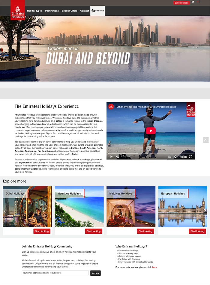
Each page should have a primary goal (inform, convert, guide) and the text should support that goal.
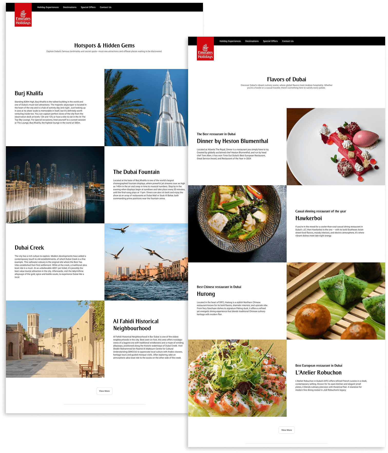
Text works best in combination with visuals (images, icons, diagrams, videos) to reduce cognitive load.
Users scan rather than read, so highlight key information instead of using long text content.
Overly wide text increases cognitive load by making line tracking harder and reading slower.
Solution
- Users should quickly find suitable packages through clear categories, smart filters, comparisons, and personalized suggestions that reduce choice overload.
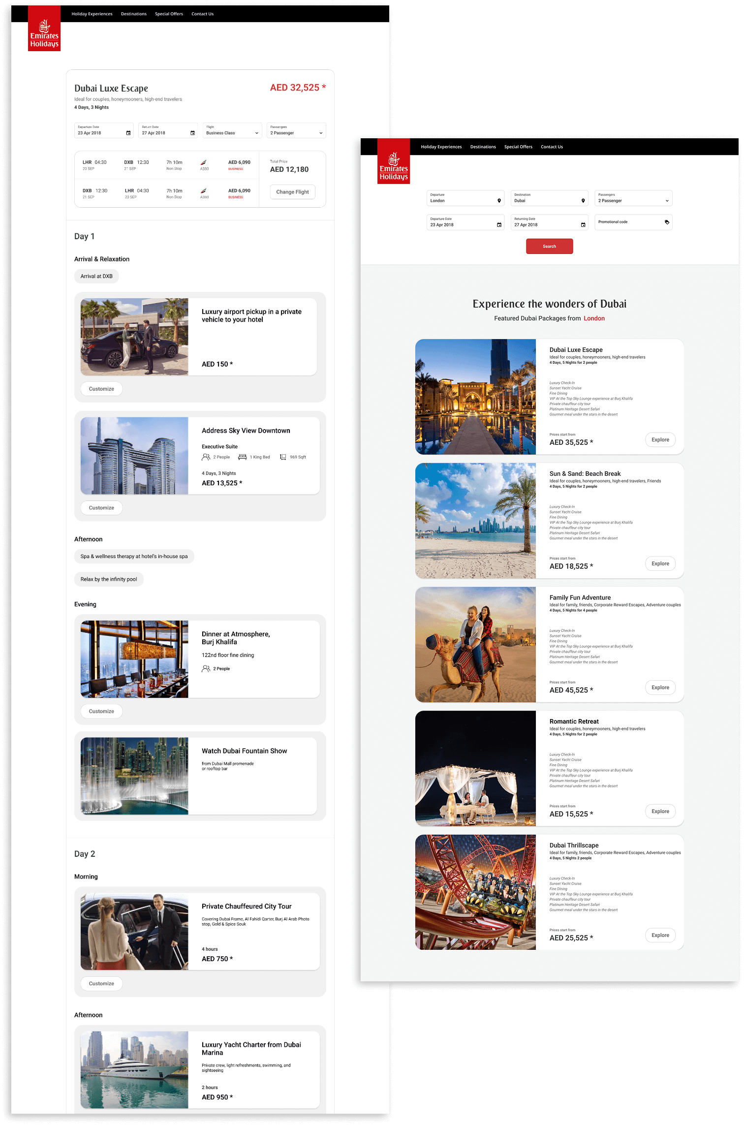
- streamline the booking flow, with minimal inputs, easy date selection, dynamic pricing, and optional add-ons, while allowing fast checkout without friction.
- Critical decisions (e.g., hotel choice, transfer selection) are provided with context or preview along with the ability to customize it.
- Packages need transparent details—itinerary, pricing, inclusions supported by rich visuals, and trust signals to build confidence and excitement.
- Upselling without friction: room upgrades, extra activities are optional, not forced.
- A visually rich yet uncluttered interface with clear hierarchy and consistency reduces cognitive load, making exploration and booking effortless.
